Stop wrestling with complex spreadsheets. Upload your customer locations, sales figures, or asset data and see it all on an interactive map in minutes. Our platform cuts analysis and planning time by up to 95%.
Our Customers Love Mapping With eSpatial
3 Reasons to Choose eSpatial
-
Optimize territories
32X faster Learn more about "Optimize territories 32X faster" -
Identify hidden
revenue streams Learn more about "Identify hidden revenue streams" -
Reduce field onboarding
time by 67% Learn more about "Reduce field onboarding time by 67%"
From Spreadsheet to Strategy in Minutes
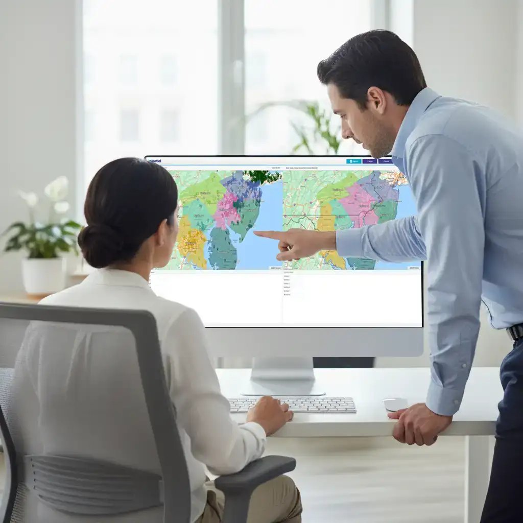
1. Unbalanced Territories Are Costing You Sales
Fix them, fast. Instantly identify and eliminate gaps and overlaps. Our powerful optimization tool lets you balance territories by any metric: Workload, potential, travel time, to create fair, high-performance areas that empower your team and boost your bottom line.

2. From Data to Decision in Seconds
Stop drowning in spreadsheets. Start seeing answers. Visualize performance, uncover hidden patterns, and identify opportunities on an interactive map. It’s the clarity you need to make faster, smarter decisions about where to grow next.

3. Maximize Your Sales and Marketing ROI
See It on the Map. Stop wondering if your campaigns are effective, prove it. Overlay marketing spend, sales results, and customer demographics to see exactly what's driving revenue and where. Double down on what works, and make smarter data backed decisions that grow your bottom line.

4. From What If? to What's Next
Model different scenarios, visualize potential outcomes on a map, and create a powerful data story that everyone can understand. It's the clarity you need to gain stakeholder buy-in, accelerate your strategy, and drive your business forward.

5. Your Data is Yours, We Keep It That Way
Your strategic data is your most valuable asset, and we treat it that way. We provide fortress-grade security and industry-leading compliance standards. You always retain full ownership and control. Focus on finding growth, not on managing risk.
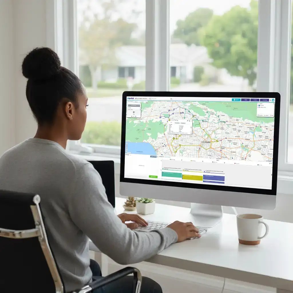
6. Slash Drive Time and Fuel Costs
Reclaim your field team's productivity and your budget. Our platform helps you instantly visualize and optimize routes to eliminate backtracking and wasted mileage. Identify your most efficient schedules, significantly cut fuel expenses, and give your field team dynamic, mobile-first routes that adapt to their day.
Favorite Map Types
Who They're for, what they do, and what they're called
| Who uses these maps? | Primary use case | Preferred map types | |
|---|---|---|---|
| Market Analysis & Opportunity Maps |
|
To identify underserved markets and reveal hidden growth opportunities by turning customer, prospect, and demographic data into visual insights. |
|
| Territory Design & Optimization Maps |
|
To create, realign, balance and optimize sales, service, or franchise territories based on data points like revenue and workload. |
|
| Sales Performance & Compensation Maps |
|
To visually link compensation data to geographic performance and territory fairness. |
|
| Route Optimization & Scheduling Maps |
|
To create intelligent, multi-stop routes for field teams, cutting travel time and increasing customer meetings. |
|
| Resource & Asset Management Maps |
|
To optimize the placement of resources and visualize real-time asset locations. |
|
| Site Selection & Demographic Maps |
|
To find the best place to host an event or open a new office using location data and demographics. |
|
| Strategic Workforce Planning Maps |
|
To pinpoint candidate hotspots, identify geographic skill gaps, and align headcount with market demand. |
|
Get Started With eSpatial Today
Our team is here to help you every step of the way

From Data to Decisive
Action, Instantly
Today, speed is your competitive edge. eSpatial gives your team the power to instantly visualize, analyze, and act on critical location data. Move from complex spreadsheets to clear, actionable maps that drive confident, collaborative decisions and accelerate your results.
Powerful Results With Maps
Pin Maps
Answer "Where?" for Every Part of Your Business.
Where are your most valuable customers? Where is sales activity concentrated? Pin maps provide the foundational view by instantly plotting every record from your data onto a map. It’s the essential first step to visualizing your distribution, understanding density, and making smarter, location-aware decisions.
Heat Maps
Instantly Find Your Hotspots & Whitespaces.
When thousands of data points create too much noise, a heat map reveals the full story. Instantly transform a cluttered map into a powerful visual analysis of density. Pinpoint exactly where sales are on fire, where customer activity is concentrated, and—just as importantly—where you have critical market gaps.
Radius Maps
Master Proximity Analysis.
Instantly answer the critical distance-based questions that drive your business. A radius map draws a perfect circle around any point, helping you to:
- Analyze your customer base: Instantly count every customer within a radius of any store or site
- Qualify sales leads: Determine which prospects are within a sales rep’s territory to prioritize high-value outreach
- Plan local marketing campaigns or events: Define a precise target area for a direct mail or digital ad campaign or event to maximize local impact and ROI
ZIP Code Maps
Be The Master Of Regional Strategy.
Stop looking at individual data points and start seeing the complete market picture. Aggregate your sales, customer, and demographic data by ZIP code to instantly uncover powerful regional trends. Visualize performance hotspots, benchmark territories against each other, and make data-driven decisions that fuel growth, one area at a time.
Territory Maps
Engineer a High-Performance Field Team.
Stop just assigning areas—strategically design them for peak performance. Our territory mapping software empowers you to carve out balanced, equitable territories that unlock your team's full potential. Eliminate wasted travel, ensure complete market coverage, and enable every rep to hit their maximum number of sales or service calls.

How It Works
Step 1
Sign Up & Upload
Your Data
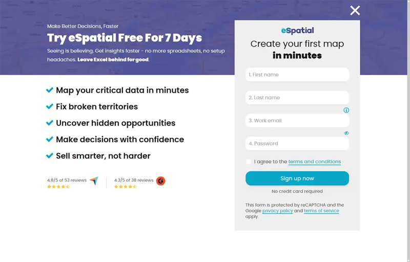
Create a free account on our website, no credit card required. Then, upload your data from spreadsheets, CRMs, or other sources. eSpatial supports multiple file types, so you can get started quickly with minimal prep.
Step 2
Map And
Customize
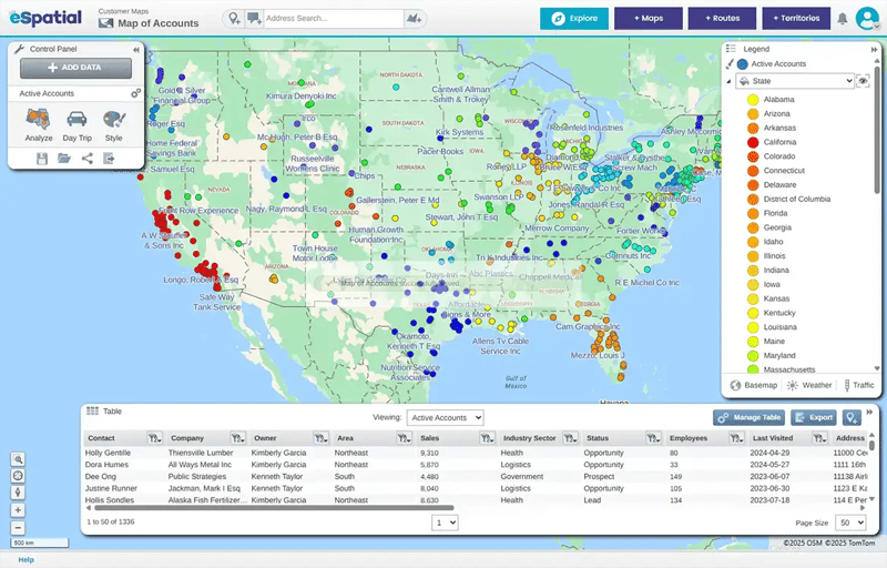
Plot your data points like stores, clients, or assets on an interactive map. Use built-in filters, labels, and styling tools to highlight trends, customize views, and layer in details like sales territories or customer segments.
Step 3
Analyze And
Share Insights
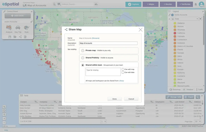
Leverage powerful analytics to create heat maps, territory plans, or optimized routes. Easily share your visual insights through exportable formats or interactive maps to accelerate decision-making across your team.
Trusted by Businesses Globally
“We wanted to know for each of our plants. What is the plant's low-cost service area? What is the geographic region around that plant? And whether that plant is the most cost-effective option to ship concrete. We wanted to take advantage of that. We also wanted to know the most costly delivery areas in central Texas. And which of our customers are in those areas.”
“The first quick win for us was that eSpatial was so easy to use. After using so many other applications, eSpatial was the easiest for importing our data and identifying the fields and hierarchies that would deliver efficient alignments. At the end of the day, you are finalizing the sales territory in front of their eyes. It is much more real to the key stakeholders, which has been transformational for Thermo Fisher.”
“Sales data can be mapped in minutes. That has saved us countless numbers of hours. And we have eliminated steps from the design and approvals process leading to faster more efficient alignments in less time. The findings in our eSpatial visualizations are definitely going to inform 2022 strategy for the better. 100%, we're going to renew our eSpatial license.”
“We're always trying to improve our output and what we're putting in front of executive management teams and boards. We started looking around at different data visualization and mapping software programs and did a fair amount of due diligence on multiple companies. After vetting various platforms, eSpatial rose to the top of our list. I personally can say that we've loved it ever since.”
“I've been in this industry for 35 years, and to have a tool that I can pick up and use quickly just means the world to me. With eSpatial, I can create reports and make changes in 20 minutes, it's easy to log in and update things quickly. You wouldn't think in mapping software you would have someone so responsive in technical support. That was the prime reason I settled on eSpatial.”
“eSpatial has been an awesome tool for Starkey. From our territory planning; splitting territories, adjusting for local details, communicating and mocking up options. Then giving that updated detail to our sales team along with live access to CRM and trip planning. And then representing everything in a beautiful way that we love to use in presentations - it is truly a very impressive package.”
“eSpatial is an irreplaceable tool for our business, for example we are now able to run one of our key processes 32 times faster and have been able to double the number of customers we can visit in a given week by making better decisions. You can't control how much time you have in a given day, but you can control how it is used and eSpatial has certainly helped us significantly with that.”
Frequently Asked Questions
What Does This Map Software Do?
If you are in sales, operations, customer service, marketing or a team leader, you can visualize customers, stores, sales, or any critical business data you want on a map to find opportunities and plan faster.
Do I Need to Be Good With It to Use It?
No. We made it really easy for you. It is super intuitive, but if you ever hit a roadblock you have access to our team who will guide you.
How Do I Get My Data Onto the Map?
Upload your data (like an Excel sheet), and the software will do your heavy lifting by plotting your points on the map in seconds.
You can also add multiple datasets.
Can I Create Maps by Hand?
Yes! Using our easy drawing tools, you can draw your own areas and territories by hand. You’re in control.
Can I See Where the Gaps Are?
Yes. You can spot whitespaces or gaps with no customers or coverage with ease.
What Are the Most Popular Maps People Create?
| Map type | Use case |
|---|---|
| Pin map | Plot and view individual data points for quick visual analysis, such as customer locations or store sites. |
| Regional heat map | Aggregate and colour-code performance by geographic region to identify high and low-performing areas. |
| Hotspot heat map | Spot data density trends, like customer or sales concentration, to reveal hotspots. |
| Territory map | Design, balance, and manage sales or service regions for fair workload distribution and revenue optimisation. |
| Route map | Plan and optimise travel routes for sales reps or logistics teams to reduce travel time and costs. |
| Bubble map | Visualise data magnitude at specific locations, such as revenue by city, using proportional bubbles. |
| Radius map | Analyse proximity by creating buffers around a point, useful for service coverage or delivery zones. |
What is a Heatmap?
A heatmap shows places where you have lots of activity (a hotspot) or little action (cold), kind of like a weather map. It is perfect for presenting complex data in an easy-to-understand format.
What Does Territory Mapping Software Do?
It helps you design, assign, divide or optimize areas between your salespeople or teams, so everyone knows where to focus and nobody overlaps.
What is Route Optimization Software?
It figures out the best way to plan your day without wasting time or gas. It is perfect for field-based teams who need to boost productivity.
Can More Than One Person Use the Map?
Yes! You can share your map with your team, and they can view it, work on it, or give feedback. You can also control sharing access rights for improved security.
Can I Try It First Before I Buy It?
Yes! You get a free 7-day trial to try everything out.
Better still you can book a call with one of our team who will take you through a customized demo.
What Happens if I Get Stuck?
You can chat with a real human from within the software who’s friendly and fast. No bots. No crazy wait times. Or you can book some time with a team member who will guide you.
How Much Does It All Cost?
You can get started for as little as $1,495 per year. You can check out our plans here.


